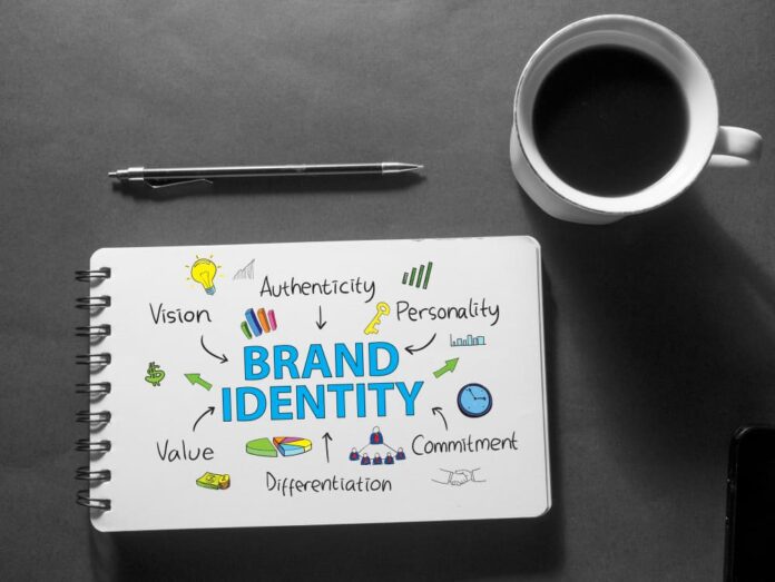
In a world saturated with ads and information, the art of minimalism in brand design isn’t just a trend—it’s a necessity. This approach strips away the superfluous, leaving only the essential elements that define a brand’s core identity. A Sydney branding agency specializing in minimalist design can attest to the power of simplicity in an increasingly complex market. This style doesn’t just capture attention; it holds it, fostering a deeper connection between the brand and its audience.
How to Adopt Modern Branding?
Minimalism in brand design is much more than the absence of clutter. It’s a philosophy centered on the idea that every design element must serve a purpose. For businesses, this means distilling a brand’s message to its purest form and presenting it in a straightforward, impactful way. This can be particularly challenging, as it requires not just artistic restraint but a deep understanding of what the brand stands for—and what it doesn’t.
Sydney, known for its clean beaches and clear skies, mirrors this design principle in many of its successful brands. Local designers and branding agencies have harnessed this aesthetic to cut through the noise, crafting brand identities that are both memorable and elegant in their simplicity. By focusing on essential elements—color, typography, and necessary imagery—Sydney brands communicate their message more clearly and effectively.
One of the first steps in adopting minimalism is understanding that less really can be more. A Sydney branding agency leveraging this style will often spend a great deal of time refining a brand’s logo, ensuring that it is not only distinctive but also meaningful. The process involves stripping down the design to its fundamental features, removing any elements that do not contribute to its overall purpose. The result is a logo that is not only easier to recognize but also easier to apply across various mediums and scales.
Role of Colors in Branding
Color plays a critical role in minimalist brand design. Instead of using a broad palette to attract attention, minimalist brands often choose a limited color scheme—sometimes even monochrome—to convey their message. This limited use of color isn’t just visually striking; it also creates a strong association between a particular hue and the brand itself. This is why a Sydney branding agency might spend considerable time selecting the perfect shade that can carry the entire weight of the brand’s visual identity.
Importance of Typography in Design
Typography in minimalist design also requires careful consideration. The right typeface can communicate a brand’s personality—be it sophisticated, friendly, or authoritative—without saying a word. The choice of type, like color, is usually restrained, with brands opting for clean and readable fonts that reinforce the clarity of the overall design. Here, the absence of excessive decorative elements ensures that the focus remains firmly on the message.
In application, minimalism extends beyond logos and color schemes; it influences all aspects of a brand’s visual identity, including packaging, web design, and advertising. A minimalist approach to packaging, for example, might feature plain geometric shapes and a restrained color palette, focusing consumer attention on the quality and uniqueness of the product itself rather than ornate packaging. Similarly, in digital spaces, a clean, uncluttered layout improves user experience and navigation, making it easier for customers to find what they need without unnecessary distractions.
Conclusion
Ultimately, minimalism in brand design is about finding the essence of the brand and expressing it in the most straightforward and impactful way possible. It’s about achieving more with less, creating a brand identity that stands out not because it’s loud, but because it’s clear. For any brand design agency Sydney, this minimalist philosophy isn’t just a design choice; it’s a strategic tool that can define a brand’s presence in a crowded marketplace.
As businesses continue to navigate a world where consumers are bombarded with choices and information, the clarity, simplicity, and focus of minimalism in brand design become not just advantageous but essential. Sydney brands embracing this approach are not just simplifying designs; they’re clarifying their message and in doing so, making a more substantial impact.


